When nobody could explain the score, they appealed it
Workera's AI evaluated thousands of skills a week. The results interface couldn't explain how. 80 appeals a day was the proof.
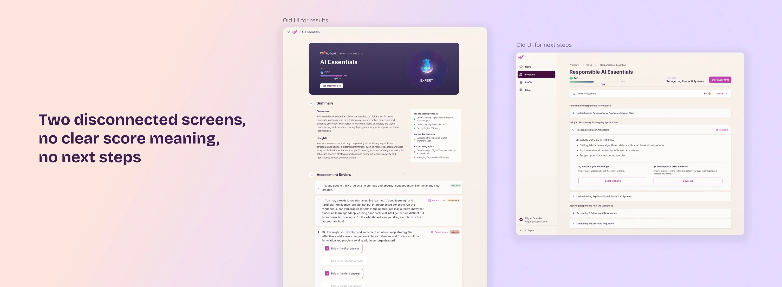
The interface gave users a verdict. Not a reason.
Workera scores users across individual skills on a four-level proficiency scale, from gap to strength. But the results experience was split across two disconnected screens that predated this model. Users couldn't tell what their score meant or see any reasoning behind it. When they disagreed with what the AI decided, the only option was to appeal, adding to a queue of roughly 80 disputes a day, each one going to a human reviewer who needed up to four business days to respond.
80 appeals a day is not noise. It's a signal: when AI produces output people can't interpret, they don't accept it.
My scope
Owned the design strategy for the entire results experience, from problem framing to post-launch. I set the research agenda, defined how the product should prioritize recommendations for each user, and drove alignment between PM and engineering on logic that had no prior precedent. I didn't receive a spec. I produced one.
Where I pushed back, and why it mattered
The platform already used Beginner, Developing, Accomplished, and Expert to describe a user's overall capability score. The team's first proposal was to reuse those same labels for individual skill ratings. I pushed back: a skill rating and an overall score are related but not the same thing, and giving them identical labels would make it unclear which one someone was looking at. I validated this in user interviews, where that overlap caused exactly the confusion I'd flagged. The outcome: skill ratings carry no labels at all, just the visual gap-to-strength scale, and Beginner through Expert stays reserved for the overall score.
That kind of call typically gets escalated. I caught it, validated it with research, and settled it before it cost anything to fix.
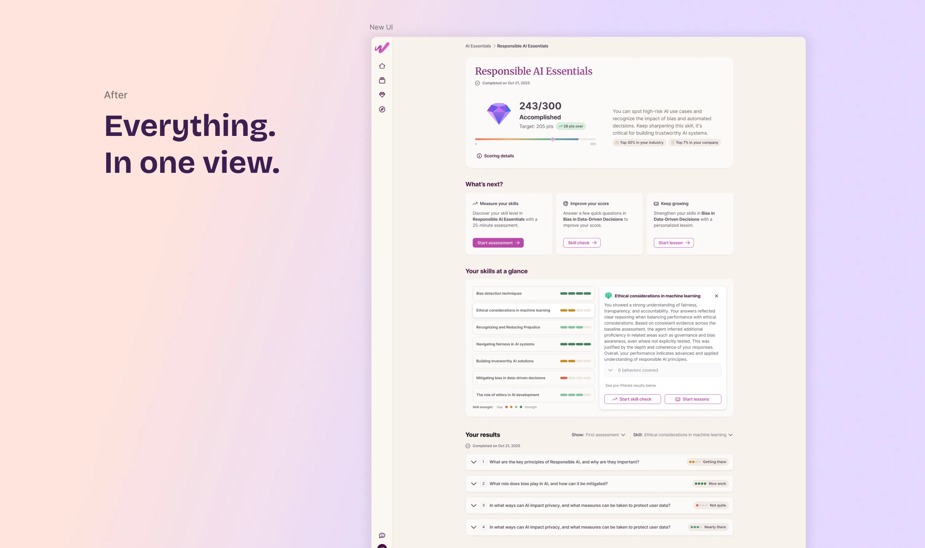
Two screens became one
Replaced the two fragmented screens with a single view: overall score, a skill-by-skill breakdown of strengths and gaps, and clear next steps. The structural fix was necessary. It wasn't sufficient.
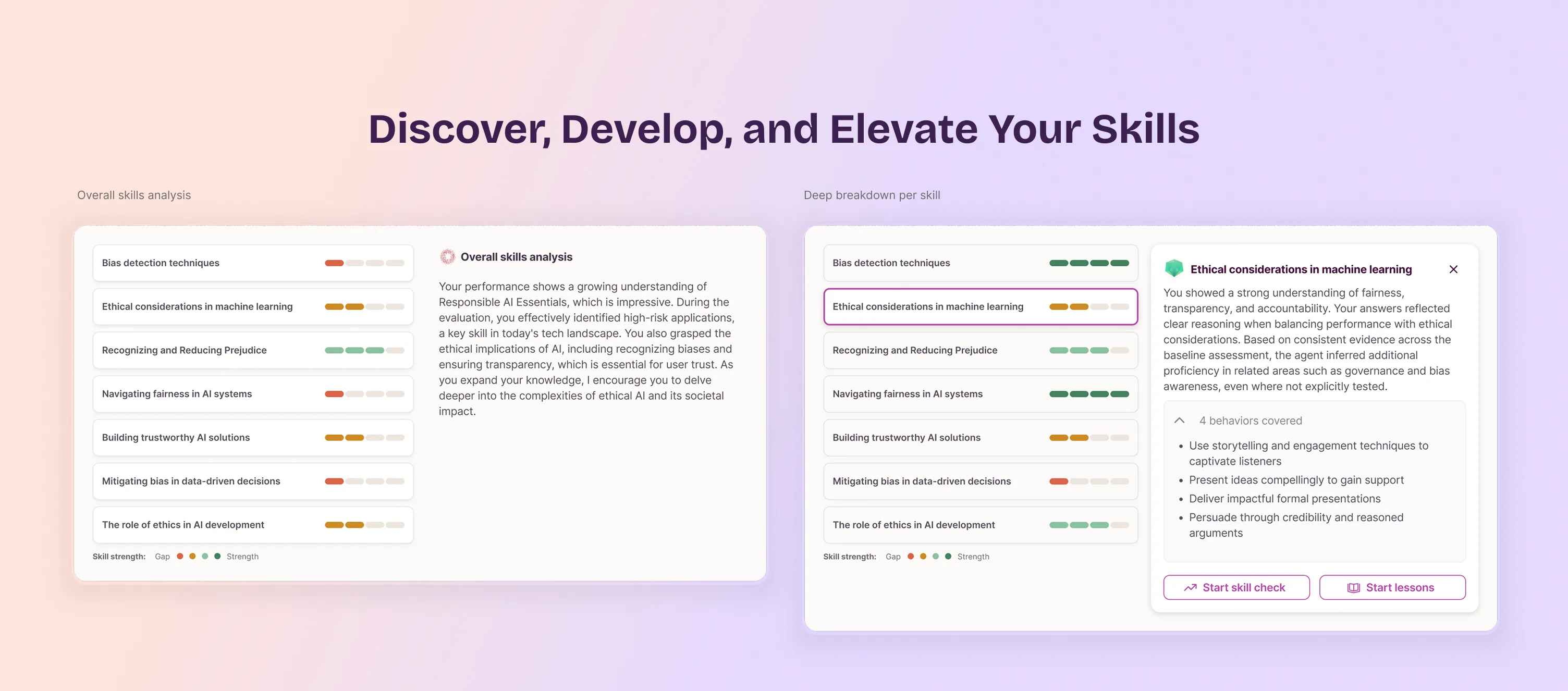
"Trust the score" isn't a design pattern
The results include an AI-generated summary that sometimes infers proficiency in skills the user never directly tested, based on the depth and coherence of their answers elsewhere. Stated as a flat conclusion, that reads as arbitrary. So each skill links to a "behaviors covered" breakdown: the actual evidence behind the claim, not just the verdict.
When that summary fails to generate, or the assessment ran on an older scoring model with no rationale at all, the interface shows no error. It leads with the same behaviors breakdown instead, using the same component as the normal state, so the fallback feels designed rather than broken.
The disclaimer nobody reads, and the button that actually works
Every score carries an explicit disclaimer: it is calculated by AI and can contain inaccuracies. That disclaimer is backed by a real process, not just a legal caveat. Appeal score routes to a human reviewer, who responds within four business days. The redesign did not replace that safety net. It reduced how often people need it. Making the AI's reasoning visible, through the behaviors breakdown and the per-question explanations below, resolves most disagreements before they reach a person. The ones that do not still go to a human, not back to the model.
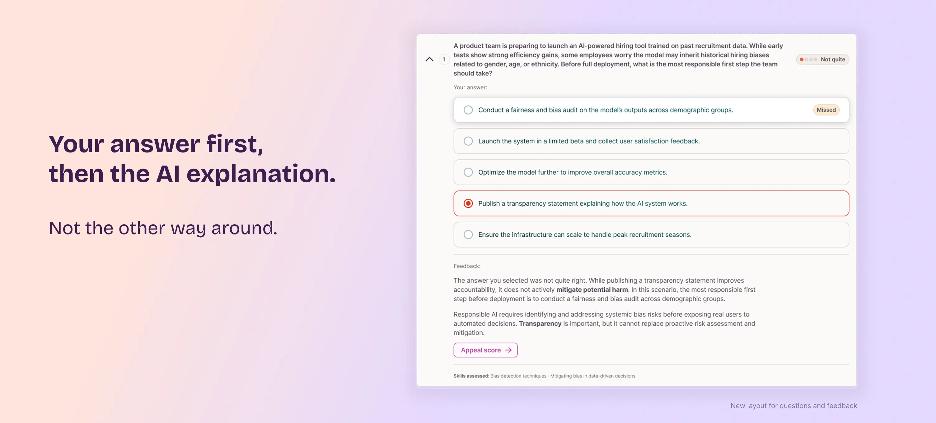
Users wanted their own answer first. The interface showed it last.
User testing showed people opened a question expecting to see their own answer first, then Workera's feedback. The previous layout did the opposite. I restructured it: your answer first, then the AI-generated explanation of why it was right or wrong, separated by clear dividers. Correctness moved to a four-level scale (Not quite, Getting there, Nearly there, Nice work) that mirrors the skill proficiency scale. "Appeal score" moved inside this expanded feedback, next to the explanation it relates to.
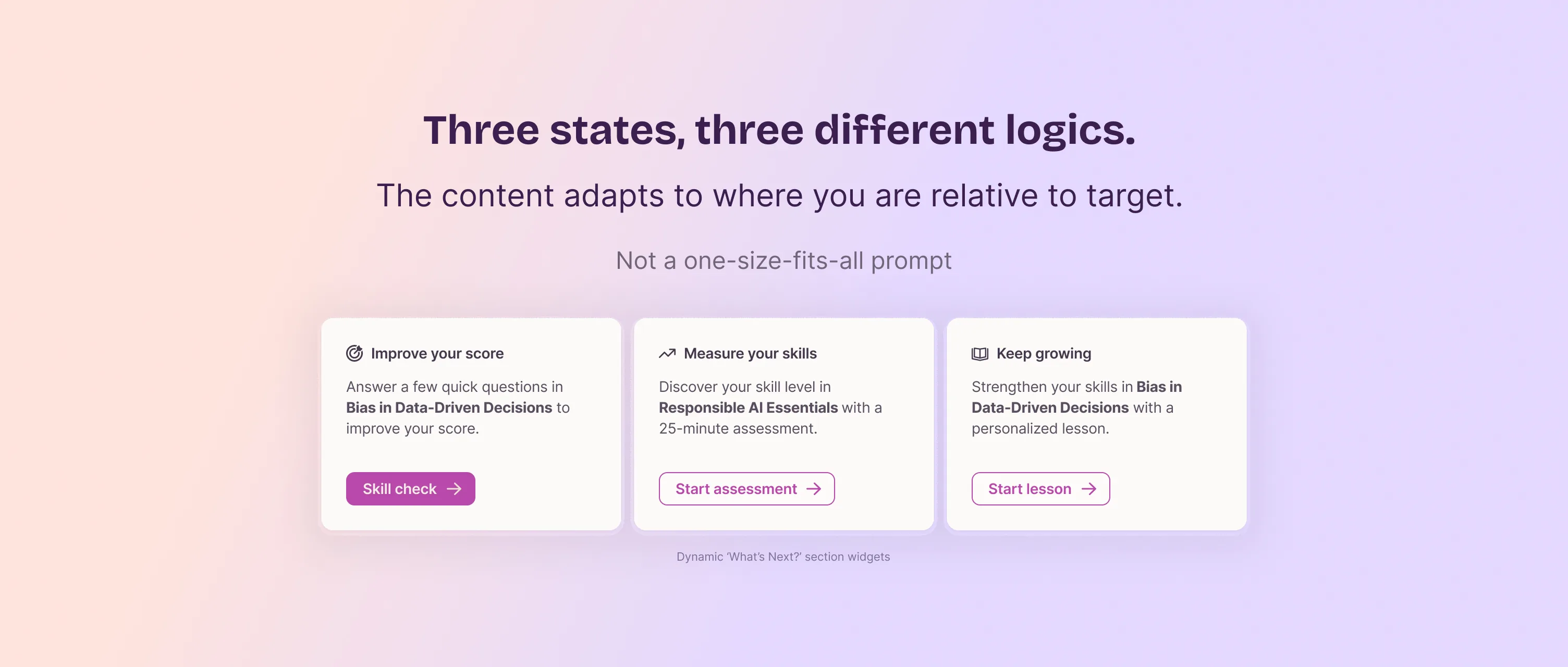
Eight interviews, one pattern: "what's next" depends on where you are
"What's Next" used to show the same prompts regardless of performance. The 8 interviews surfaced a clear pattern: what someone needs next depends entirely on their score relative to target. Below target, they want to improve. At or above target, they want a new challenge. At the maximum, "improve your score" makes no sense at all. I defined the prioritization rules for each state (which actions appear, in what order, which one gets the primary call to action) and validated them with PM and engineering.
78% fewer appeals in the first month
Live since mid-May 2026. In the first month, roughly 7,000 assessments ran through the new results experience.
Appeals dropped from an average of 80 a day to about 18. The likely driver: appealing now means opening and reading the AI's explanation first, and for most people, that explanation resolves the disagreement before it becomes a dispute.
Skill Check and Mentor interactions also increased after launch, suggesting the new recommendations land as more relevant, not just better explained.
What I take from this
When AI output is opaque, people don't extend benefit of the doubt. The 78% drop in appeals confirmed that making the reasoning visible changed how people related to the score, far more than any visual redesign would have.
- Designed the interface for a generative AI system: presenting probabilistic, inferred output and its failure states as something legible and trustworthy, while keeping a human review path for when it is wrong.
- Pushed back on a proposal with research, not opinion: flagged a labeling collision before it shipped, then used user interviews to confirm it and settle the decision.
- Translated user research directly into product logic: the recommendation rules came from interviews I ran, not a handed-down spec.
- A clear line between a design decision and a business outcome: relocating one button changed how an entire support process behaves.
- The recommendation logic I defined with PM and engineering is live and measurable. I owned it through to the rules that shipped, not handed it off as a proposal.