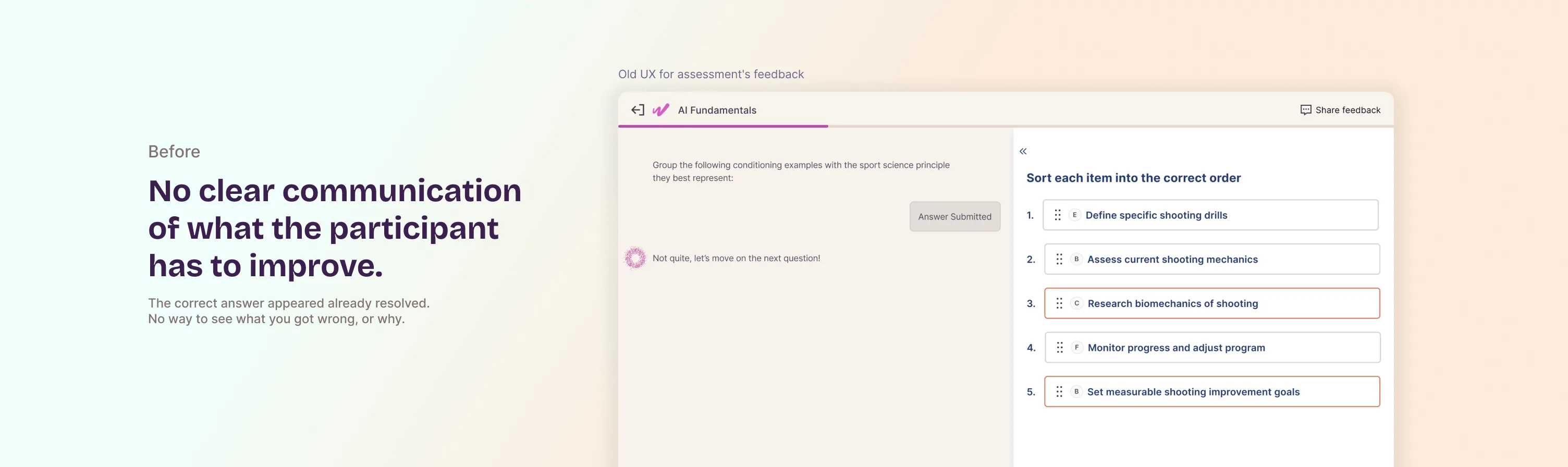
The interface showed you the answer. It never showed you what you got wrong.
For matching, ordering, and grouping questions, users got the AI's correct result. They never got to see their own attempt next to it. Identifying this from research, designing around it, and validating the fix with users before shipping.
You got it wrong. Here's the answer. Good luck figuring out why.
Workera's matching, ordering, and grouping questions check a user's attempt against a result generated by an LLM: the correct groups, the correct order, the correct pairs. When someone got a question wrong, the interface showed that generated result already resolved, paired with an encouraging message, but never showed their own attempt next to it. No way to compare, no way to pinpoint the mistake. Just the solution, handed over as if context were optional.
I found this through user interviews and a pattern the Appeals team kept surfacing: disputes from people who couldn't understand how the expected result related to what they'd submitted. They weren't disagreeing with the AI. They couldn't read the gap between their answer and it.
My scope
Full ownership from problem identification to post-launch. I found this problem — it wasn't assigned to me. I identified it in user interviews and Appeals data, defined the solution, ran multiple prototype rounds with stakeholders, and validated with usability testing before it shipped. Not execution on someone else's spec. The spec started here.
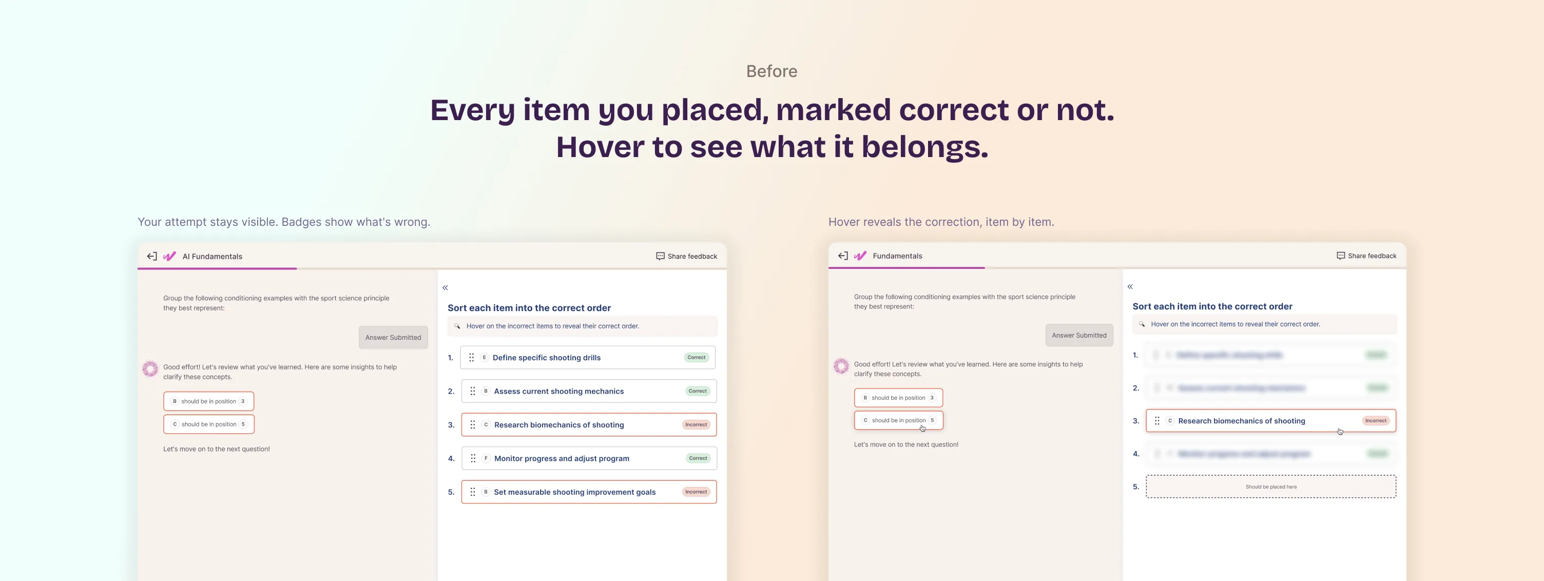
From verdict to navigable diagnosis
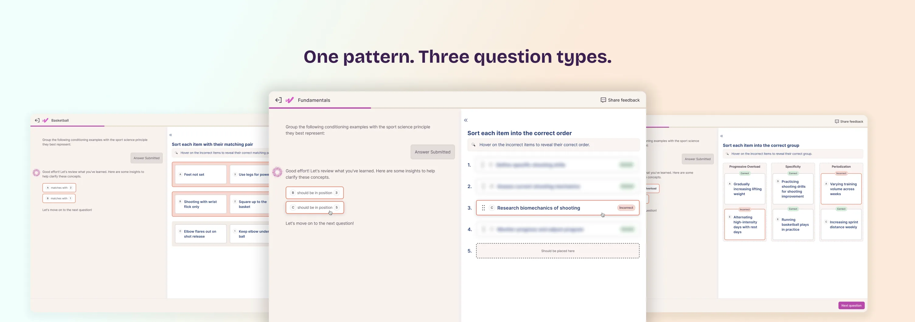
Replaced "here's the correct answer" with each item in the user's own attempt carrying a Correct or Incorrect badge, while keeping their original arrangement visible. Hovering an incorrect item reveals where it should go according to the model's output: which group it belongs to, what position it should hold, or what it should pair with. People can now go error by error and compare their reasoning to the model's, instead of just being handed the solution.
The first few versions didn't work
Prototyped several approaches, including a side-by-side comparison layout and a diff-style highlight, before converging on badges plus hover. The side-by-side version read clearly in isolation but created confusion in the grouped question type, where items have nested structure. The diff approach added visual noise that made the incorrect items harder to spot, not easier. Badges emerged as the most legible across all three question types. The final version went through usability testing before shipping, not just internal review.
A safety net for when the model's answer is wrong
"Share feedback," visible throughout the question, lets people flag a mismatch with that specific question's result, which routes to a human review. Same principle as the Appeal score in Case Study 1, applied at a different point in the journey: mid-assessment, question by question, rather than only at the final summary.
Results
Live since December 2025, rolled out across all three question types at once. In usability testing, participants stopped asking why an answer was wrong: they could see it directly and identify their mistake faster than with the previous design.
A pattern the product kept using
After launch, the Appeals team reported fewer disputes on matching, ordering, and grouping questions. The same pattern, correctness badges plus hover to reveal, was adopted on other screens, both participant-facing and internal. When a pattern travels across the product, it means it solved something bigger than the screen it started on.
What I take from this
Showing an answer and explaining an answer are different things. The interface was doing the first. Users needed the second. A simple distinction with a lot of surface area once you start designing around it.
- Owned the full cycle: spotted the pattern in research, proposed and designed the solution, iterated with stakeholders, validated with users, shipped it. Not execution of someone else's spec.
- The same underlying problem as Case Study 1 (making an AI system's output legible and trustworthy), solved in a different part of the product with a different mechanism.
- Multiple prototyped versions before converging: the first two approaches had real problems that only became clear when testing them across all three question types.
- A safety net placed where it's needed: a way for people to flag the model's output when it's wrong, routed to a human, mid-assessment rather than only at the end.
- Introduced a pattern the team adopted beyond the original scope. Shipping a feature is one thing; having the approach transfer is another.