Bigdata's first subscription system
Bigdata had no self-serve upgrade path. When the trial ended, the sales team called you. Designing the system that replaced that process entirely: tier structure, plan selector, checkout, and activation inside the native app.
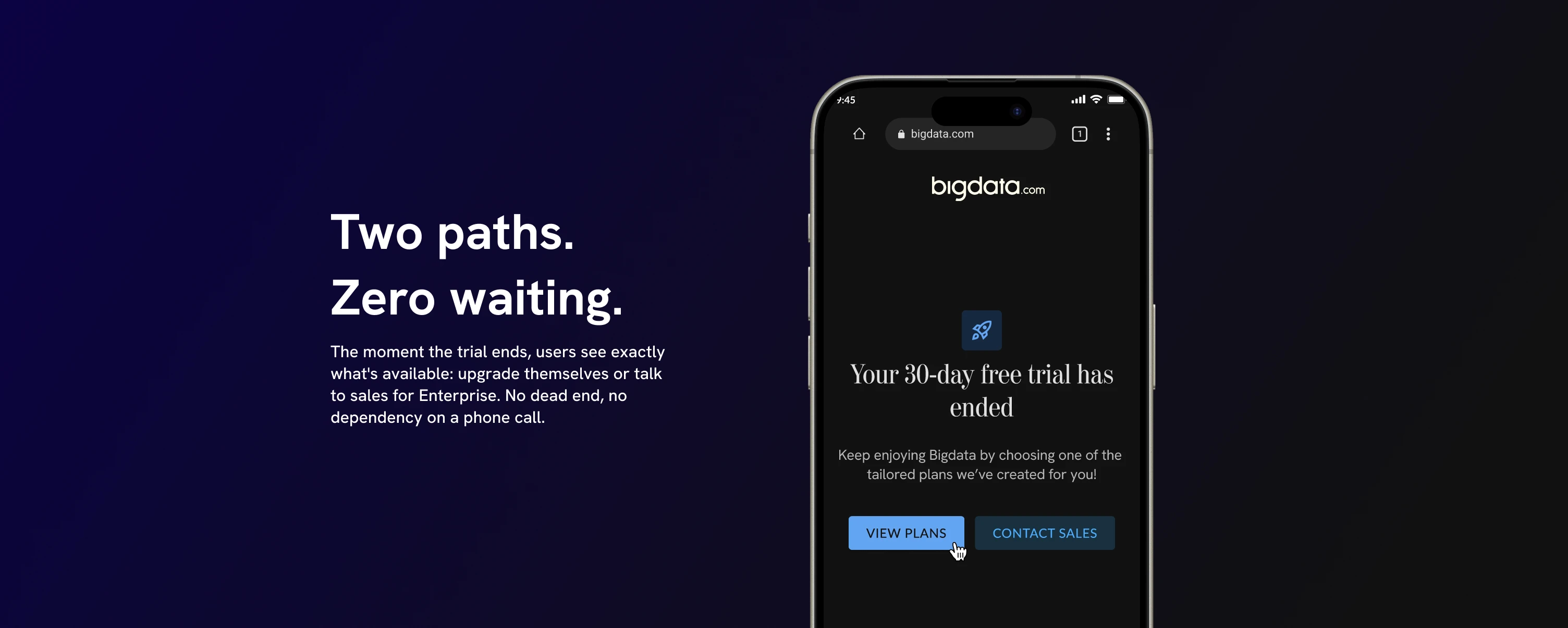
The trial ended, and a sales rep called you. Maybe.
Bigdata ran a 30-day free trial. When it ended, there was no upgrade path inside the product. No plan selector, no checkout, nothing. If a user wanted to continue, they waited for the sales team to call them. The entire process depended on a person making a phone call at the right time, to the right user, with the right pitch. It was manual, time-consuming, and completely out of the user's control.
Users who were ready to pay had no way to do it themselves. Revenue depended on sales bandwidth. And any user who hit the trial limit before that call came through had one option: leave.
The task was to replace that process entirely: design Bigdata's first self-serve subscription system from zero, including the tier structure, the plan selector, the checkout flow, and the activation moment inside the native app.
My scope
Co-defined the subscription model with product and engineering: tier structure, what each plan included, and the logic for splitting self-serve from Enterprise. Then designed every screen in the upgrade path, from trial expiry through to activation inside the native app.
Three tiers, two purchase paths
The subscription model landed as three tiers: Pro ($50/month billed annually), Pro + Investor Bundle ($100/month, targeting financial data professionals who need earnings calls, SEC filings, pricing data, and sentiment analysis), and Enterprise at a price set by conversation.
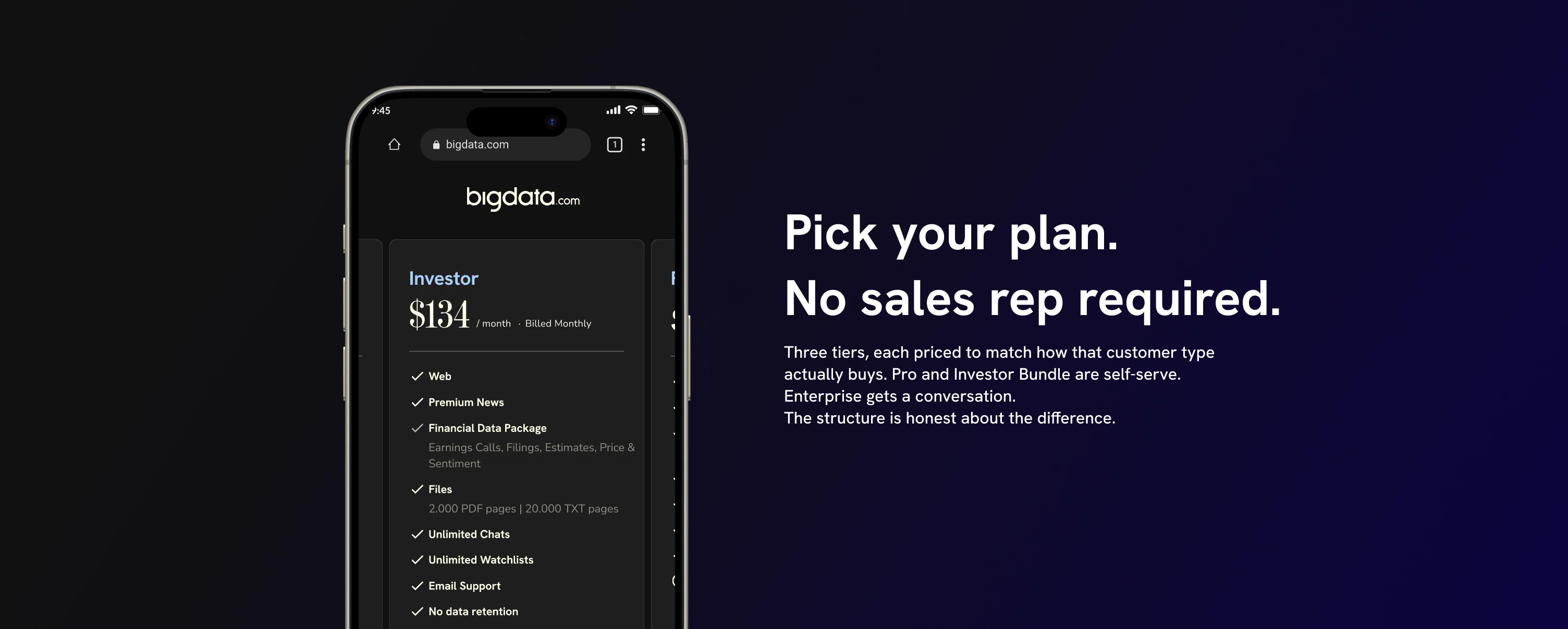
The two-path decision was a product call, not a UI choice
Showing "Talk to us" instead of a price for Enterprise wasn't a design preference. Pro and Investor Bundle have fixed scope you can evaluate and buy in a few taps. Enterprise means shared infrastructure, dedicated account management, and an organizational rollout that doesn't reduce to a checkout flow. Making that distinction explicit in the product architecture was a joint call with product, and it maps directly to how each customer type actually buys.
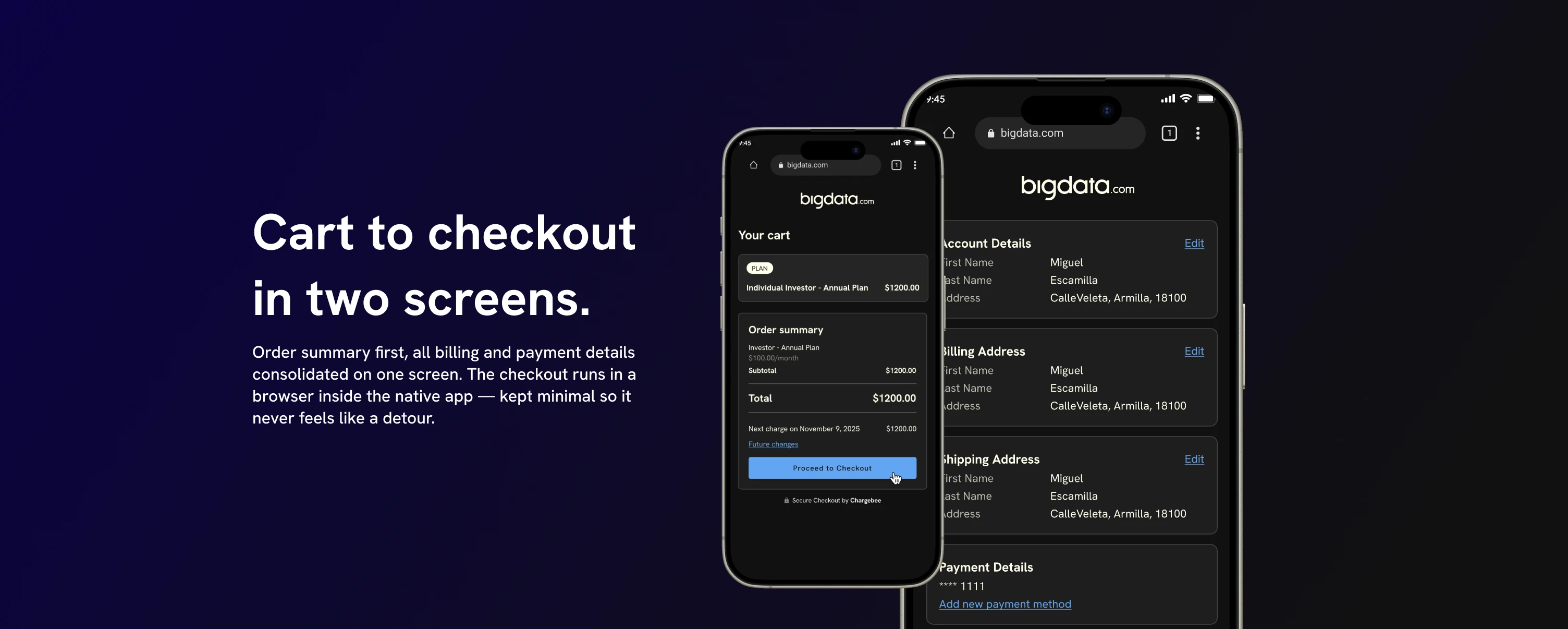
The checkout had to live in a browser. Inside a native app. Here's why that's a problem.
The checkout opens in the browser rather than inside the native app. Payment processing via Chargebee ran on the web, an engineering constraint that created a real design challenge: how do you keep the experience from feeling like the user just left the product?
The answer was to keep the checkout linear and minimal: cart with a clear order summary, a single "Proceed to Checkout" CTA, then a consolidated billing screen showing account details, billing address, and payment method in one place before confirming. No extra steps, no upsells, nothing that competes with the main action. Chargebee handles the security layer. The design handles clarity.
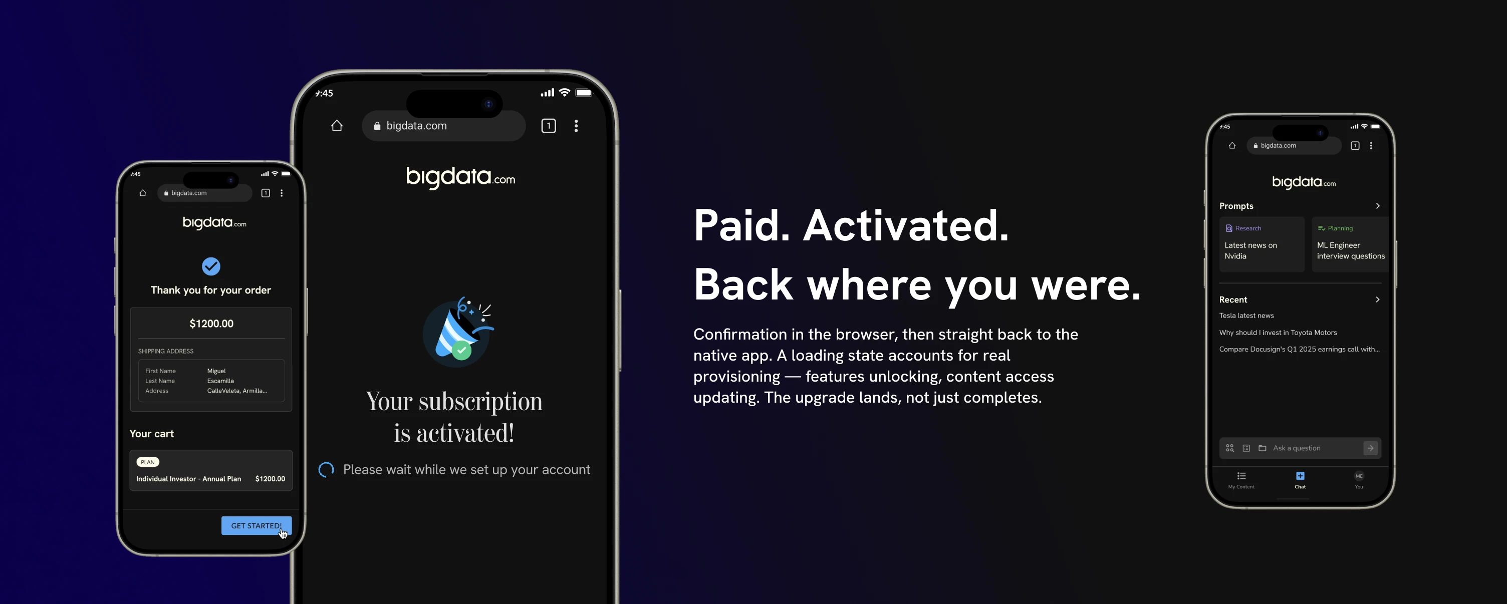
Paid. Confirmed. Now get them back into the product.
After payment, the user sees a confirmation screen in the browser with a "GET STARTED!" CTA. That button closes the web view and hands them back to the native app, where a loading state bridges the gap while the backend provisions the new plan. The loading state exists because there's real work happening: features unlock, content access changes, the UI updates to reflect the new tier. Showing that process instead of hiding it tells the user something is happening on their behalf.
Sales improved. The bottleneck was gone.
The team confirmed conversions improved after launch. The previous model couldn't capture recurring revenue at all: it depended entirely on a sales rep calling at the right moment. Removing that dependency was the point. Users who were ready to pay could do it on their own timeline, not the sales team's.
What I take from this
Most subscription work is about optimizing a flow that already exists. This was replacing a process that was never a product. The real design challenge wasn't the checkout screens. It was making a user-driven upgrade path feel as trustworthy as a conversation with a salesperson, without the salesperson.
- Designed a complete subscription system from nothing: tier structure, every screen in the upgrade path, and the handoff between web checkout and native app.
- Solved a real constraint: a web checkout inside a native app, kept minimal and with a deliberate re-entry moment rather than leaving users stranded in a browser.
- Co-defined a business model alongside product before designing a single screen. The two-path architecture maps directly to how Pro and Enterprise customers buy, not to what was simplest to build.